06. Other Adaptations of Bivariate Plots
L5 061 Other Adaptations Of Bivariate Plots V3
DataVis L5C06 V2
Other Adaptations of Bivariate Plots
You also saw one other way of expanding univariate plots into bivariate plots in the previous lesson: substituting count on a bar chart or histogram for the mean, median, or some other statistic of a second variable. This adaptation can also be done for bivariate plots like the heat map, clustered bar chart, and line plot, to allow them to depict multivariate relationships.
If we want to depict the mean of a third variable in a 2-d histogram, we need to change the weights of points in the hist2d function similar to how we changed the weights in the 1-d histogram.
xbin_edges = np.arange(0.25, df['num_var1'].max()+0.5, 0.5)
ybin_edges = np.arange(7,    df['num_var2'].max()+0.5, 0.5)

# count number of points in each bin
xbin_idxs = pd.cut(df['num_var1'], xbin_edges, right = False,
                    include_lowest = True, labels = False).astype(int)
ybin_idxs = pd.cut(df['num_var2'], ybin_edges, right = False,
                    include_lowest = True, labels = False).astype(int)

pts_per_bin = df.groupby([xbin_idxs, ybin_idxs]).size()
pts_per_bin = pts_per_bin.reset_index()
pts_per_bin = pts_per_bin.pivot(index = 'num_var1', columns = 'num_var2').values

z_wts = df['num_var3'] / pts_per_bin[xbin_idxs, ybin_idxs]

# plot the data using the calculated weights
plt.hist2d(data = df, x = 'num_var1', y = 'num_var2', weights = z_wts,
           bins = [xbin_edges, ybin_edges], cmap = 'viridis_r', cmin = 0.5);
plt.xlabel('num_var1')
plt.ylabel('num_var2');
plt.colorbar(label = 'mean(num_var3)');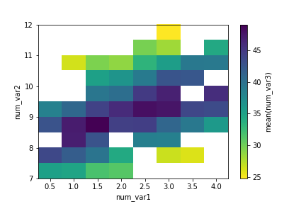
Considering how few data points there are in the example, and how cleanly the third variable is distributed, the adapted heat map is a bit excessive in terms of work. The low level of point overlap observed earlier means that the scatterplot with color or size encoding was sufficient for depicting the data. You'll be more likely to use the heat map if there is a lot of data to be aggregated.
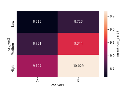
The code for the 2-d bar chart doesn't actually change much. The actual heatmap call is still the same, only the aggregation of values changes. Instead of taking size after the groupby operation, we compute the mean across dataframe columns and isolate the column of interest.
cat_means = df.groupby(['cat_var1', 'cat_var2']).mean()['num_var2']
cat_means = cat_means.reset_index(name = 'num_var2_avg')
cat_means = cat_means.pivot(index = 'cat_var2', columns = 'cat_var1',
                            values = 'num_var2_avg')
sb.heatmap(cat_means, annot = True, fmt = '.3f',
           cbar_kws = {'label' : 'mean(num_var2)'})
Note how the "cbar_kws" provides an additional argument to the colorbar component of the heat map call.
An alternative approach for two categorical variables and one numeric variable is to adapt a clustered bar chart using the barplot function instead of the countplot function:
ax = sb.barplot(data = df, x = 'cat_var1', y = 'num_var2', hue = 'cat_var2')
ax.legend(loc = 8, ncol = 3, framealpha = 1, title = 'cat_var2')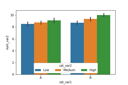
The "hue" parameter can also be used in a similar fashion in the boxplot, violinplot, and pointplot functions to add a categorical third variable to those plots in a clustered fashion. As a special note for pointplot, the default rendering aligns all levels of the "hue" categorical variable vertically. Use the "dodge" parameter to shift the levels in a clustered fashion:
ax = sb.pointplot(data = df, x = 'cat_var1', y = 'num_var2', hue = 'cat_var2',
                  dodge = 0.3, linestyles = "")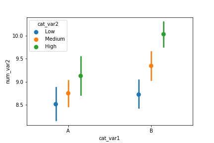
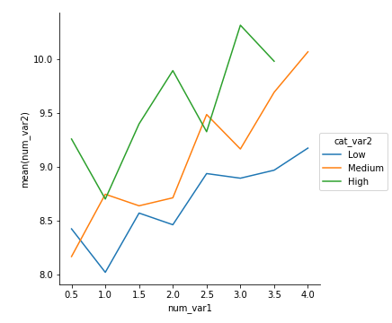
As a final example, a line plot can be adapted from previous code showing how to create frequency polygons for levels of a categorical variable. In this case as well, we create a custom function to send to a FacetGrid object's map function that computes the means in each bin, then plots them as lines via errorbar.
def mean_poly(x, y, bins = 10, **kwargs):
    """ Custom adapted line plot code. """
    # set bin edges if none or int specified
    if type(bins) == int:
        bins = np.linspace(x.min(), x.max(), bins+1)
    bin_centers = (bin_edges[1:] + bin_edges[:-1]) / 2

    # compute counts
    data_bins = pd.cut(x, bins, right = False,
                       include_lowest = True)
    means = y.groupby(data_bins).mean()

    # create plot
    plt.errorbar(x = bin_centers, y = means, **kwargs)

bin_edges = np.arange(0.25, df['num_var1'].max()+0.5, 0.5)
g = sb.FacetGrid(data = df, hue = 'cat_var2', size = 5)
g.map(mean_poly, "num_var1", "num_var2", bins = bin_edges)
g.set_ylabels('mean(num_var2)')
g.add_legend()